
Design Check: Is Your Digital Product Ready to Publish?
You finished the product. Before you hit publish, give the design one last check.
A good digital product doesn’t need to look complicated. It needs to be clear, readable, consistent, and easy to use.
Use this quick design checklist to catch the little problems that can make an otherwise useful ebook, workbook, planner, checklist, template, or PDF feel unfinished.
1. Can you read it comfortably?
Open the product at the size your customer will actually use.
Check the body text, captions, labels, instructions, and anything placed inside a box or graphic. Nothing should require squinting, zooming, or leaning toward the screen.
Design check: Can you read every important word comfortably at actual size?
2. Is it obvious what matters first?
Look at a page for five seconds, then look away.
What did you notice first? Second? Third?
Your title, main idea, and next action should not compete for attention. Size, weight, position, spacing, and contrast should help readers understand the hierarchy before they read every word.
Design check: Does the visual order match the order of importance?
3. Does everything line up?
Small alignment mistakes have a surprisingly large effect.
Look for headings that almost share an edge, boxes that drift slightly out of position, inconsistent margins, and elements that appear misplaced rather than intentionally different.
Design check: Do repeated elements begin, end, and align consistently?
4. Does it feel like one product?
Compare several pages side by side.
Your fonts, colors, spacing, image treatment, headings, callouts, captions, and recurring components should feel related. They don’t need to make every page identical. They need to make every page feel like it belongs to the same product.
Design check: If you shuffled the pages, would they still look like members of the same family?
5. Did you test the awkward page?
Don’t test your design system only with the beautiful page.
Try the longest heading. The densest page. The largest picture. The awkward screenshot. The long link. The checklist with one item too many.
A good system should bend without breaking.
Design check: Does your hardest page still work without shrinking the text or abandoning your rules?
You found the link.
If you arrived here from the stress-test page in Design Better Digital Products, congratulations.
The link works.
Which means you have successfully completed one extremely small part of your pre-publish quality assurance.
Unfortunately, there are still all those other pages.
The Digital Product Design Check Poem
Check the type.
Check the space.
Check what’s drifting out of place.Check the crop.
Check the grid.
Check that nothing weirdly slid.Check the heading.
Check the text.
Can your reader tell what’s next?Check the colors.
Check the flow.
Is there room for things to show?Test the page that’s packed and long.
That’s where hidden things go wrong.Then one final check before
you send your product out the door:Readable? Clear? Aligned? Correct?
Consistent? Tested? Then ship the project.And if you’ve checked it all with care,
there’s only one thing left to do:Publish the thing.
We’re done in here.
One last design check
Before you publish, ask:
Readable?
Clear?
Aligned?
Consistent?
Stress-tested?
Five yeses?
Go publish something good.
About Design Better Digital Products
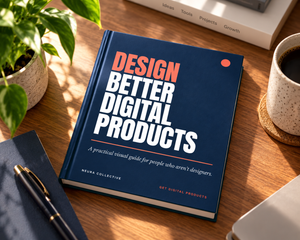
Design Better Digital Products: A Practical Visual Guide for People Who Aren’t Designers helps creators make ebooks, workbooks, planners, checklists, carousels, and templates look more polished and professional without turning design into a degree program.