The One-Person Brand Style Guide: What to Actually Write Down
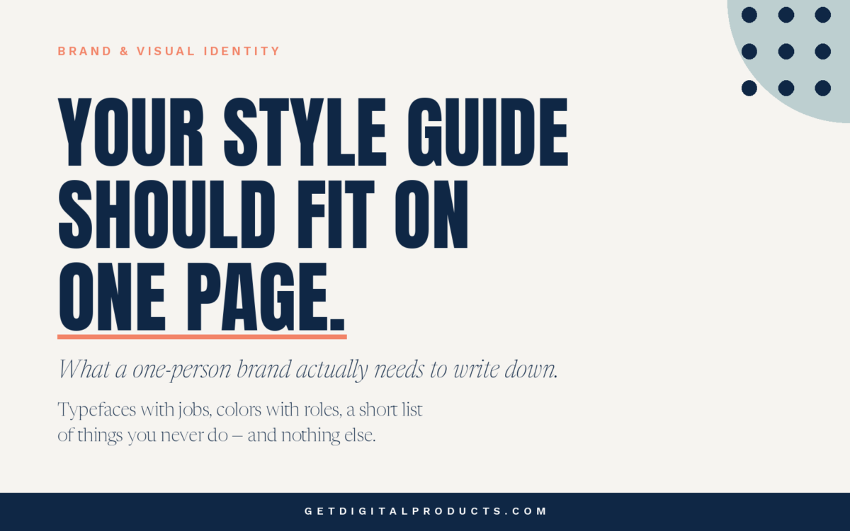
Short answer: far less than the templates tell you. A one-person brand style guide that fits on a single page and gets used beats a twenty-page brand book that gets opened once. The test is not whether it is complete. The test is whether it settles the decisions you keep making over and over.
Almost every guide on this subject is written for businesses with employees, agencies, printers, and people who need to be told what your brand is because they weren’t there when you decided. If you are the only person making things, that problem does not exist. You have a different problem, and it needs a different document.
Your actual problem is not coherence among people
It is consistency across time.
You picked a shade of blue in March. In September, you are making a social graphic at eleven at night, and you pick a slightly different blue because you are working from memory and the first one is not in front of you. Nobody else did that. You did. Six months later, your shop, your emails, and your Instagram are three related but distinguishable brands.
That is the failure a one-person brand style guide exists to prevent. Not miscommunication, but drift. And a short list fixes drift you can actually find, not a document describing your mission and values.
The four things worth writing down
Here is what earns a place, with a real example after each. The example is the system this shop runs on, called Ink & Coral.
1. Typefaces, with jobs attached
Listing font names is not enough. The decision you remake every time is not which fonts do I own but which one does this particular piece of text get. Write down the job, not just the name.
Ink & Coral uses three. Anton for display headlines, always in capitals. Newsreader for body text and for italic subtitles. Work Sans at semibold for small letterspaced labels and eyebrows. That is the whole typography section. Three typefaces, three jobs, no ambiguity about which one a piece of text gets.
Three is a useful ceiling. Two is often enough. Past four, you are no longer choosing; you are guessing.
2. Colors, with roles attached
Same principle. A palette of hex codes tells you what is allowed. It doesn’t tell you what each one is for, which is what you actually have to decide.
Ink & Coral is navy, coral, and a warm off-white. Navy carries almost all the text. Coral is an accent and never body copy. The off-white is the background that lets the other two work. When a new format comes along — a carousel slide, a product cover, an email header — the roles already answer most of the question before you start.
Write the hex codes down too. You will not remember them, and a near-miss is worse than an obvious difference because it reads as sloppiness rather than variety.
3. A short list of things you never do
This is the section the templates leave out, and it is the most useful one.
A style guide full of permissions makes every decision open. A few firm prohibitions close off the choices that were tempting you. Ink & Coral has a handful: article graphics use type and flat shapes rather than photographs; coral is never used for body text; nothing uses a fourth typeface.
You only have to make each of those decisions once. That is the entire value.
4. One finished example
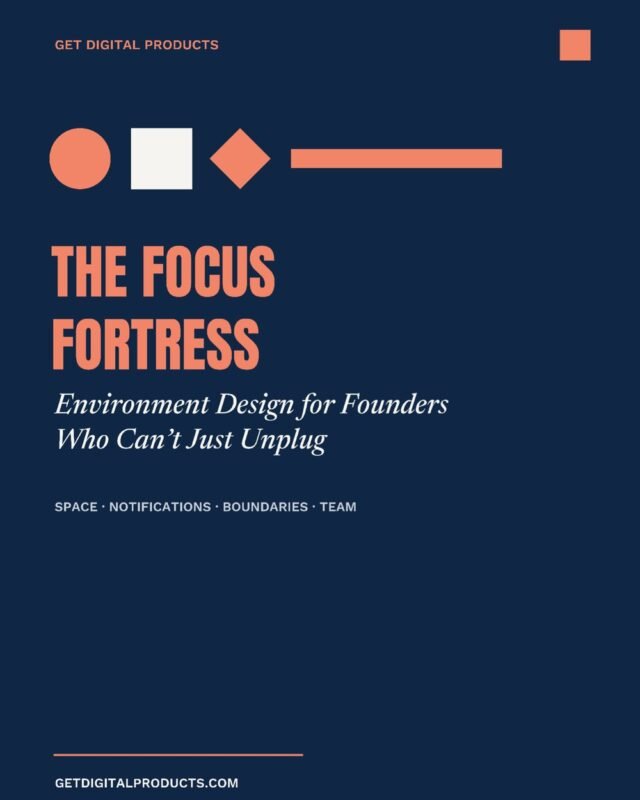
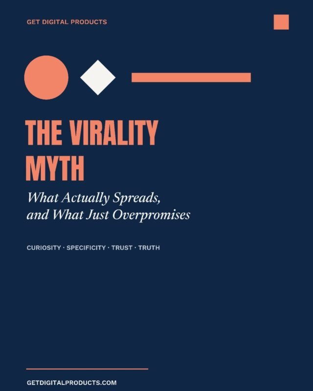
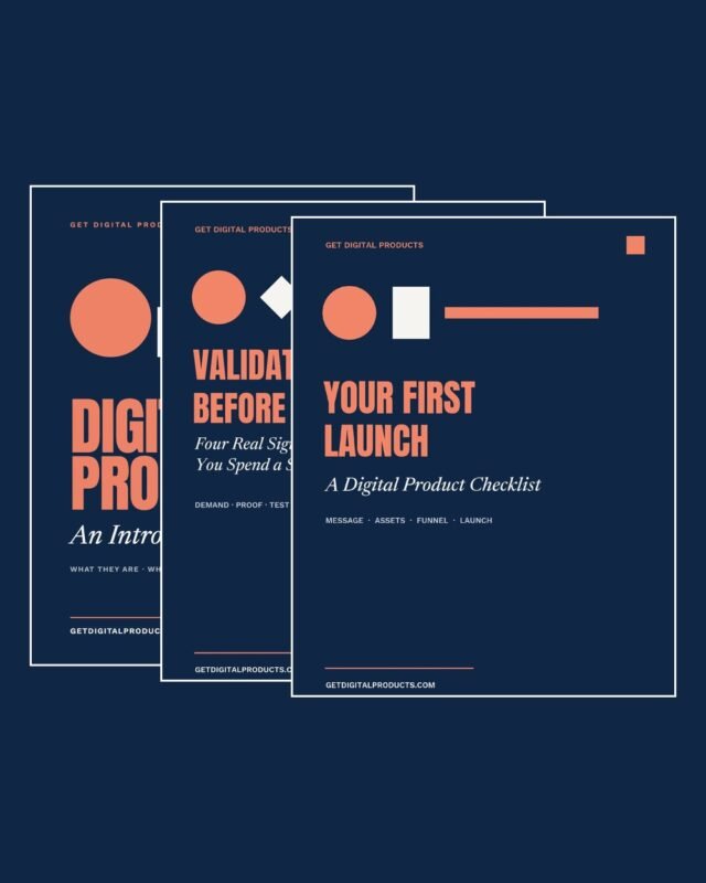
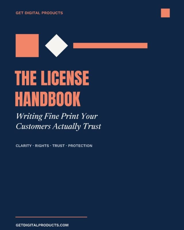
Rules read abstractly until you see them applied. Put one real, finished piece in the document such as a product cover, an article graphic, whatever you make most, and let it show the spacing, the hierarchy, and the proportions that no written rule captures well.
When you are making the next one at eleven at night, you will look at the example rather than read the rules. That is fine. That is what it is for.
What to leave out
The standard template will push you toward sections you do not need yet.
Mission, vision, and values. Useful for aligning a team. If you are the team, you already know, and writing it down does not change what you make on Tuesday.
Logo clear-space rules. These exist because someone else will place your logo badly. Nobody else is placing your logo.
Extensive tone-of-voice documentation. Your voice is the way you already write. A few notes on things you specifically avoid are worth more than pages describing a personality.
Photography direction, if you do not use photographs. Obvious, and routinely ignored just because the template has a section for it.
None of these are wrong. They are just answers to problems you do not have yet, and every one of them makes the document longer and therefore less likely to be opened.
Where to keep it
Somewhere you can open it in under ten seconds from the device you actually work on. A pinned note, a single document, the first page of your design file. If retrieving it takes effort, you will work from memory instead, and working from memory is the thing the guide exists to stop.
One page is the target. If it runs to three, ask which parts you have looked at in the past month.
When to expand it
Two triggers are worth watching for.
The first is other people. The moment a developer, a virtual assistant, or a contractor makes something customer-facing, the document has to start explaining rather than reminding. That is a real rewrite, not an addition.
The second is a new format that continues to cause hesitation. If every video thumbnail takes twenty minutes because the rules do not cover it, that is a gap worth closing with a few lines.
Outside those two, resist adding. A guide grows through buildup and becomes less useful with every page.
Frequently asked questions
How long should a one-person brand style guide be?
One page. If it is longer, it is probably documenting decisions you do not actually remake often enough to need a reference for.
Do I need a logo before I can have a style guide?
No. Typefaces, colors, and a few rules will carry a brand a long way on their own. A wordmark set in your display typeface is a perfectly respectable starting point.
Should I include my brand story and values?
Not while you are the only one making things. Those sections exist to align other people. Add them when there are other people.
How many fonts should a one-person brand use?
Two or three, each with a defined job. Past that, you are making a fresh decision every time instead of following a system.
What is the difference between a style guide and brand guidelines?
In practice, people use the terms interchangeably. Brand guidelines usually imply the longer, team-facing document; a style guide can be the one-page version described here.
The short version
Write down your typefaces with their jobs, your colors with their roles, a short list of things you never do, and one finished example. Keep it to a page, keep it somewhere you can reach in seconds, and leave out everything that exists to explain your brand to people who do not work here.
The goal of a one-person brand style guide is not to describe your brand. It is to stop you from re-deciding things you already decided.
If you are building the underlying system rather than documenting it, our Brand & Visual Identity products cover the decisions that come first.